Jupiter Power was funded and ready to take the energy storage sector by storm with a new, strategic approach to revolutionize the industry.
Jupiter Power was ready to shake up the energy storage world.
Backed by Encap Investments LP, they felt confident in their rock-star team & sure of their solution.
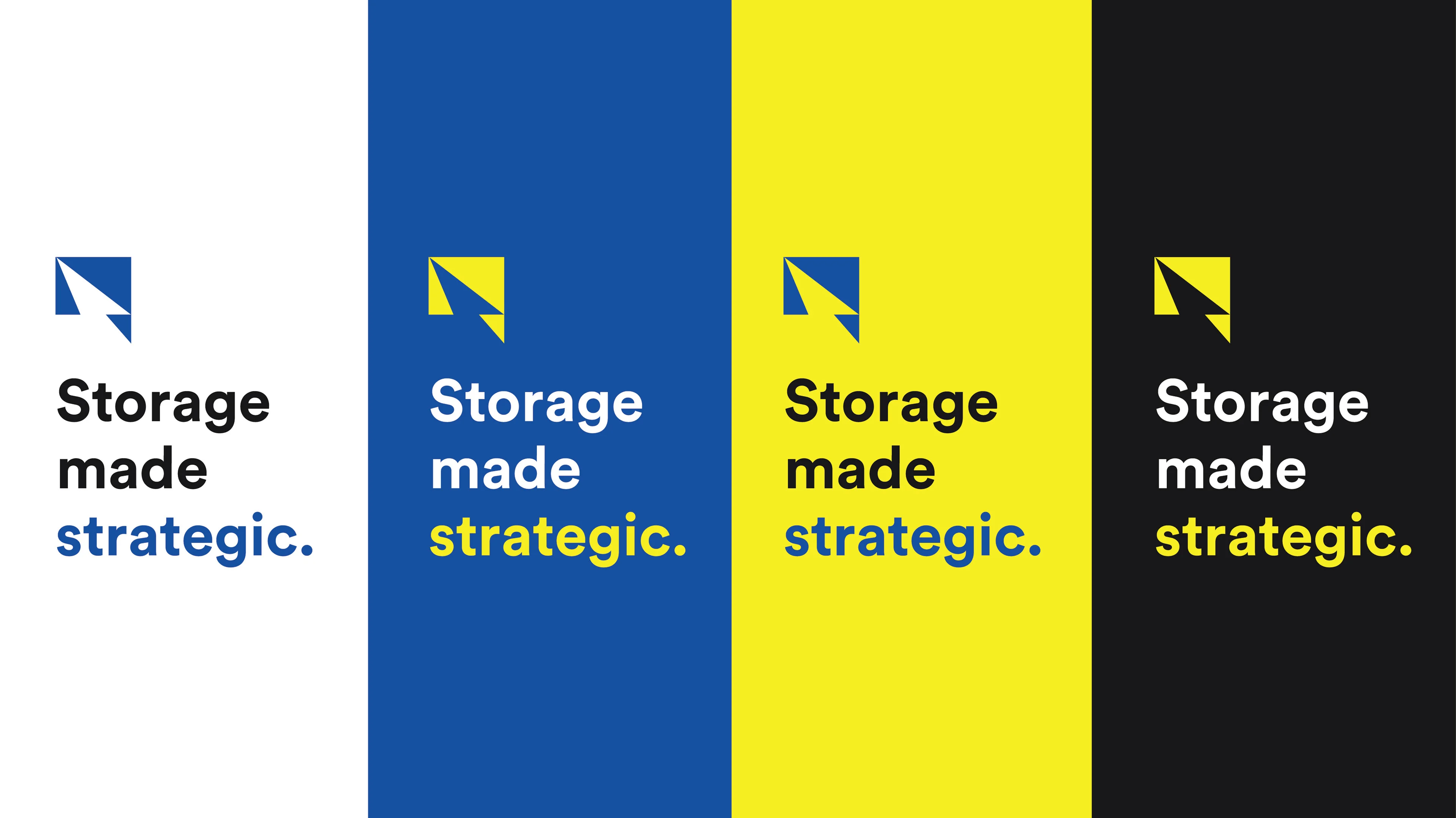
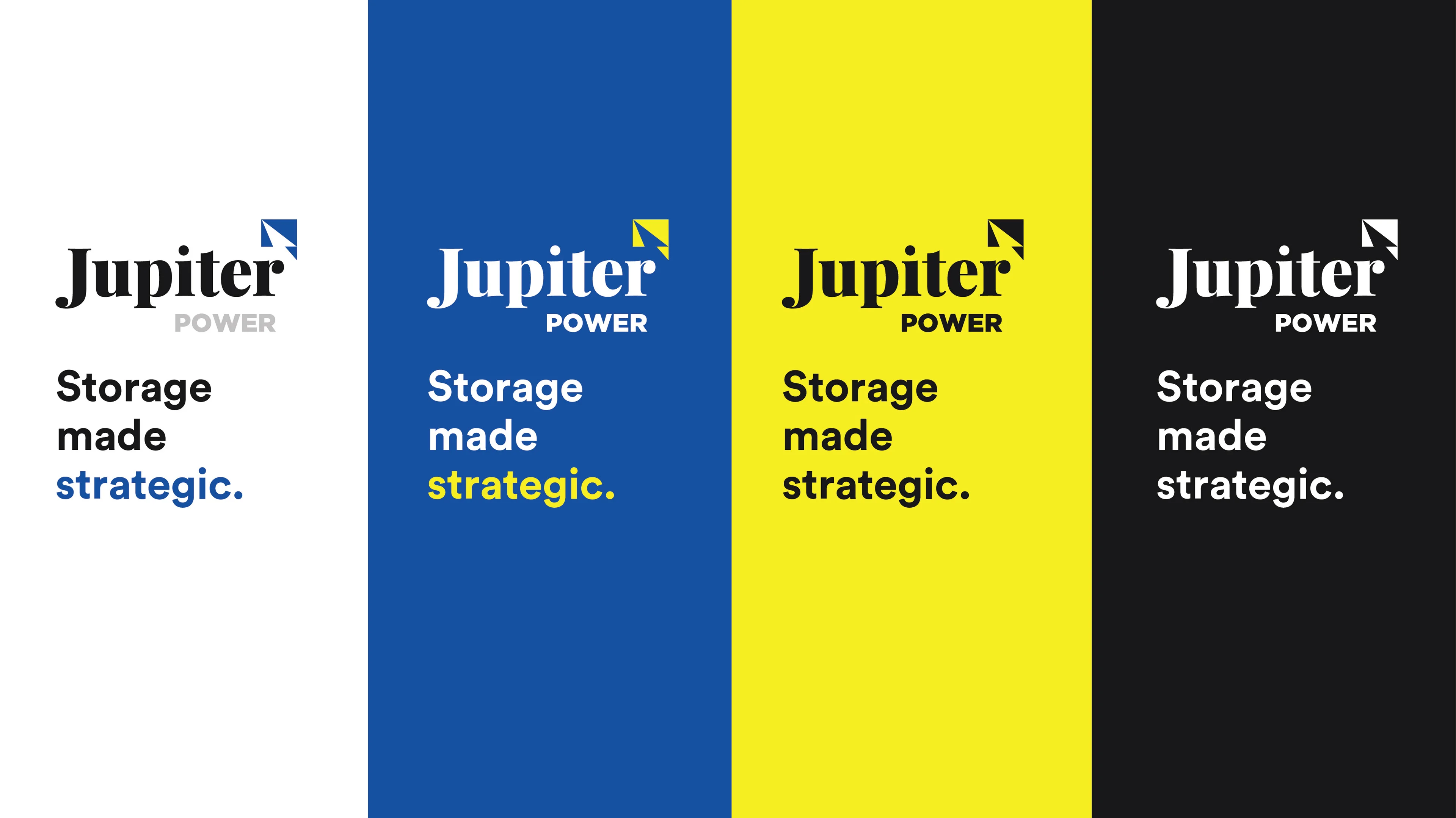
Now all they needed was a brand that communicated this confidence upon launch—and most importantly that could signal why their approach to storage was differentiated + revolutionary.
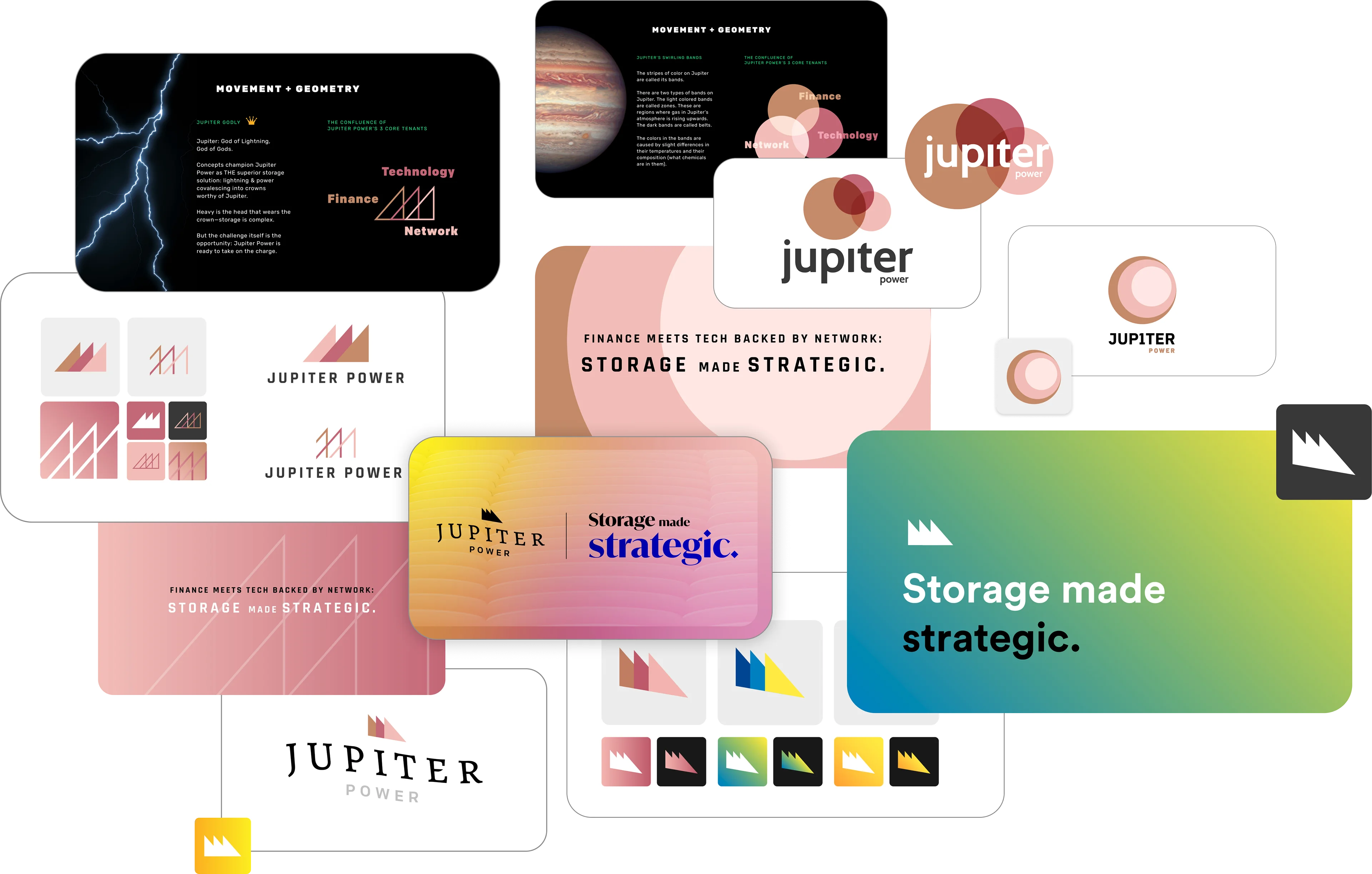
As we explored logos that resonated with “Jupiter Power”, messaging that spoke to their storage strategy began to formulate from the back and forth iterative process.

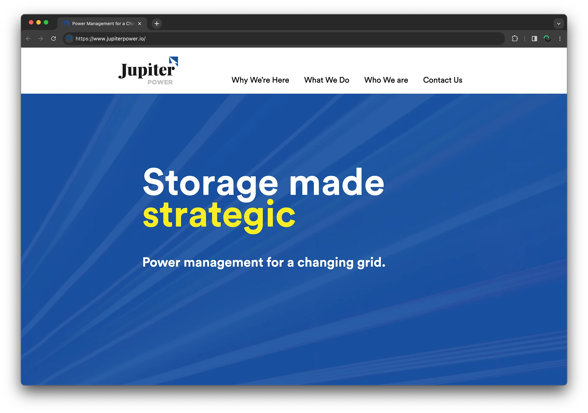
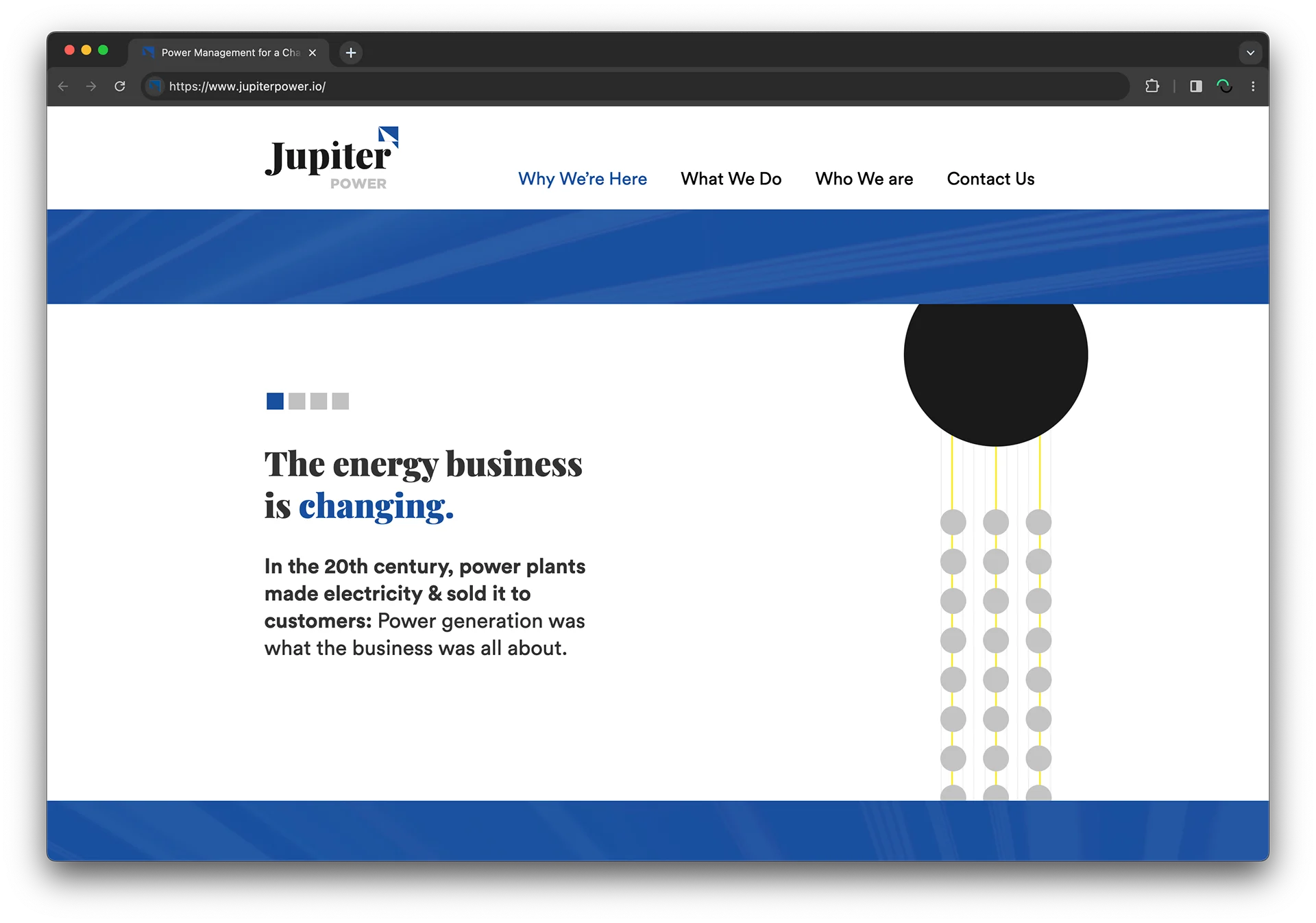
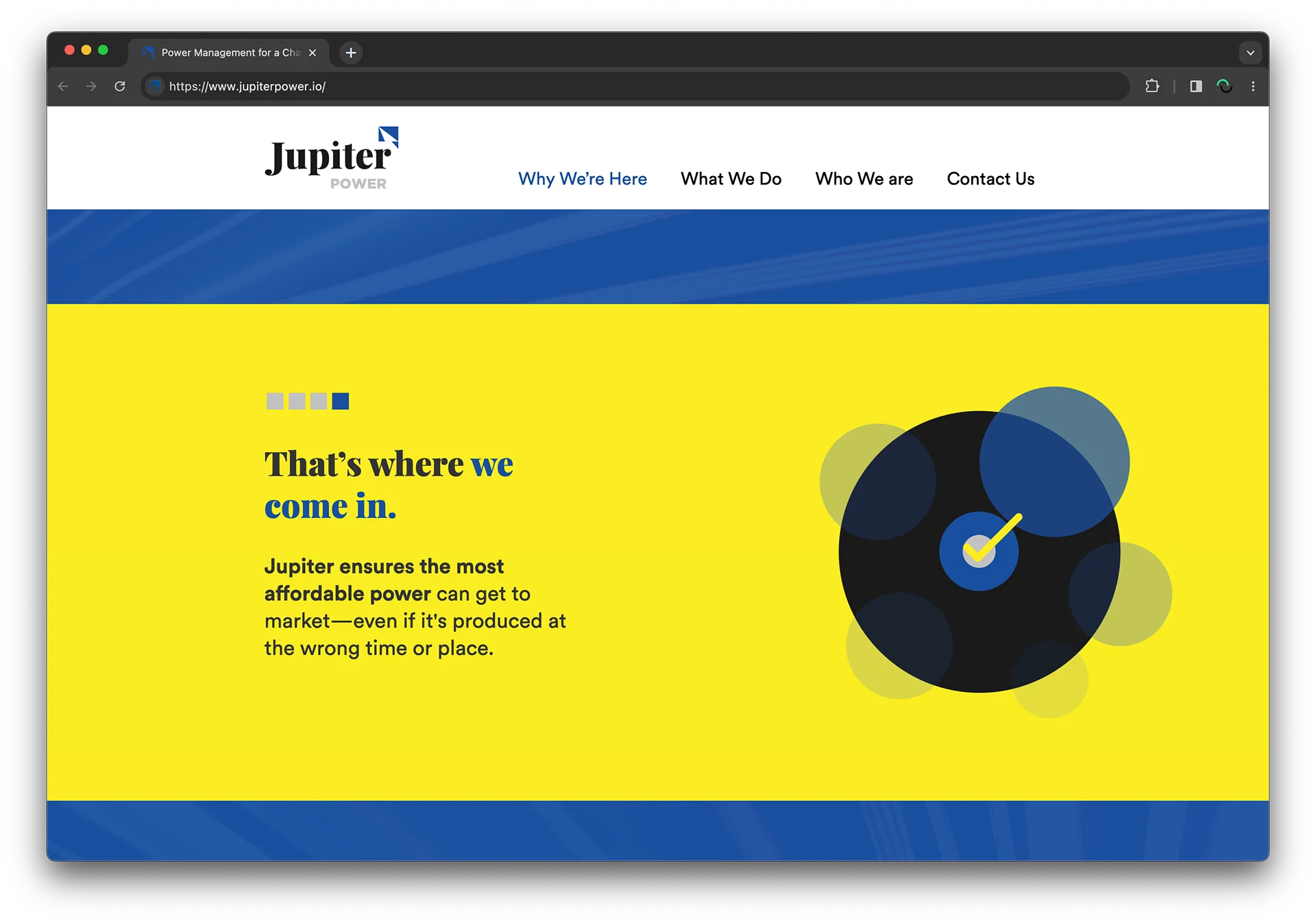
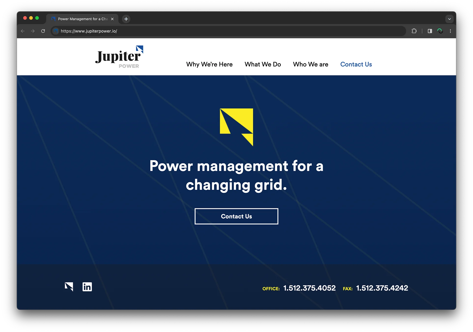
A digital presence aligned with the brand to champion Jupiter Power’s differentiated approach to energy storage.

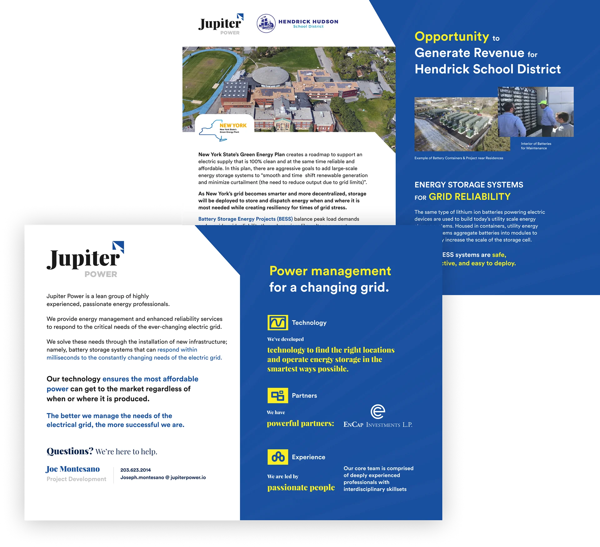
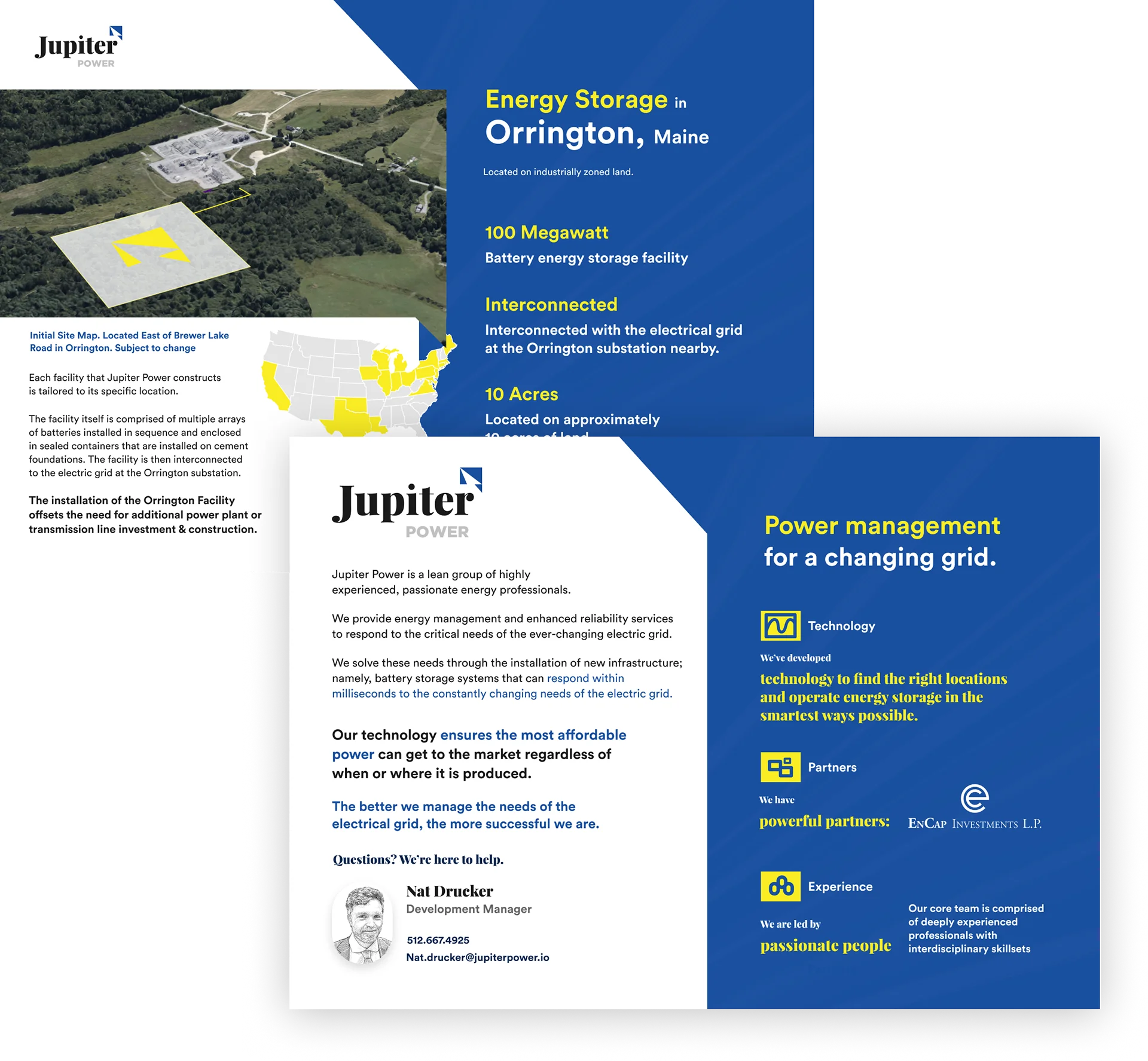
Setting up replicable design systems for sales team members to create brand-aligned one pagers.